6 Hypotheses to Test on Your Online Forms
By Alun Lucas
February 9, 2023
Share
Guest Author Alun Lucas, Zuko Analytics
Forms are often the neglected stepchild of the optimization process. Despite being the most sensitive part of your site where your customers commit their precious personal or financial information, forms are often treated as an afterthought; grafted onto a site build or experimentation program after the “sexier” elements like homepages or product showcases have been dealt with.
That said, any business that acquires prospects or customers using forms should be considering how to improve its conversion rate. At Zuko we have been using data and analytics to optimize forms for years so have seen all the common UX issues that can cause users to abandon their journey. This article outlines 6 hypotheses to test on your online forms to detect whether you are inadvertently driving potential customers away.
Hypothesis 1: Users don’t want to answer a particular field
In many businesses, forms are built with the marketing, fulfillment, and compliance departments in mind with the user only as an afterthought. This leads to questions being asked that annoy or repel potential customers unnecessarily. Classic examples of these are questions asking about the customer’s interests or for personal information they don’t feel are relevant to the service you are offering.
One question that often falls into the category is the phone number field, particularly when it comes to eCommerce. Customers have already provided their email and their physical address. They are wary that you are asking for their phone number so you can spam them with sales calls. This has been backed up by research from the Baymard Institute that found that unexplained requests for phone numbers were a significant cause of user abandonment.
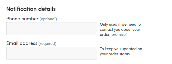
If your data suggests that you may have this issue, test it by removing the field or by adding copy that explains why you need the information.

Here is a good use of explanatory micro copy from Firebox.
Hypothesis 2: You are using a sub-optimal field format
Matching the format to a question is one of the most important things you can do. Textboxes, dropdowns, radio buttons, sliders and checkboxes are the most used formats on a form.
While picking the right format may seem simple, we’ve seen many cases where it has all gone horribly wrong. Sliders often deliver a difficult user experience, particularly on mobile. Dropdowns with dozens of options may lead the user to abandon in frustration if they can’t easily find the answer they want.
If you suspect that the format for one of your questions is putting users off, then testing other methods of asking for that data is the way to determine if a different UI will improve the user experience.

If your dropdown is as unfriendly as this example you should probably test a new solution!
Hypothesis 3: Your form isn’t optimized for mobile
Your dev team may have put your form together on their nice shiny macs where everything looks pixel perfect and easy to interact with. In the real world with tiny device screens and slow internet connections things might not work out so well.
If your form analytics data is showing a significant conversion difference between desktop and mobile users, then you may have this problem. To test it, you’ll need to conduct experimentation on the mobile form. Some of the elements you may want to research and test include:
- Are you just rendering your desktop form on your mobile site? If you’ve ever completed a form that has done this you’ll know that trying to click on a textbox a couple of pixels high is like trying to play the world’s most difficult game of Where’s Waldo. Build your form using responsive design principles.
- Do you have a dropdown menu that’s so big it falls off the bottom of your page?
- Are all the buttons big enough to click? (WCAG 2.1 recommends a target size of at least 44 x 44 pixels)
- Is the font size large enough? (Minimum 12 pixels)
- Do you have modals that are obscuring important areas of the form?
Hypothesis 4: You are validating answers at the wrong time
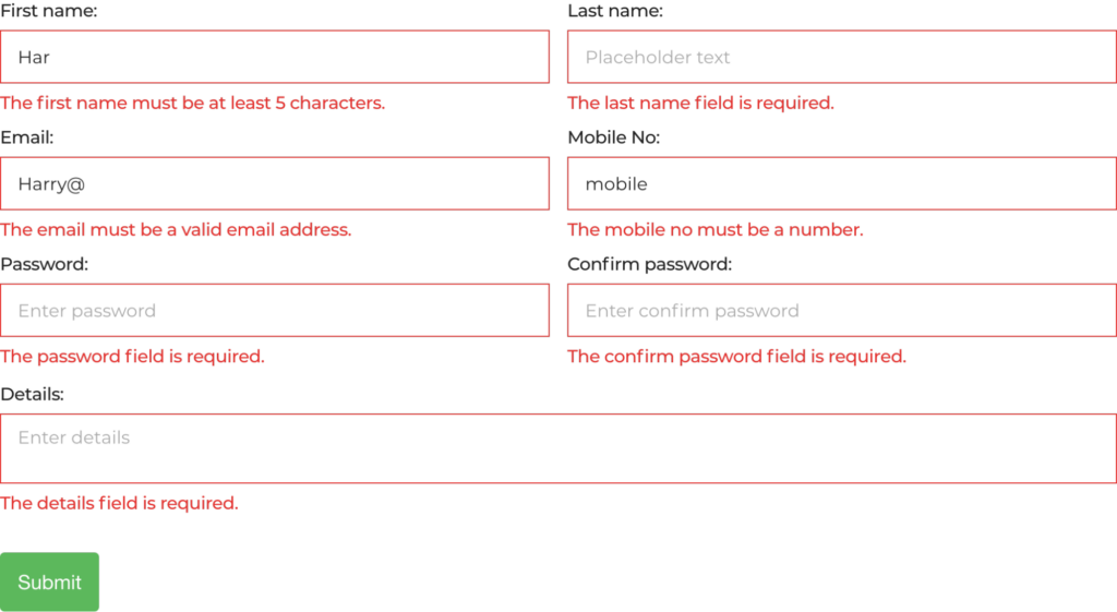
If you are only triggering error messages upon a submit button you probably have a lot of room for improvement. It can be hugely frustrating for users to spend time filling out your finely crafted form only to click the final button and be confronted by a sea of red. Even worse, sometimes they can’t even see the error messages as they are located at the top of the form outside of the frame. Needless to say, experiences like this are enough for some users to abandon in anger.

Users hate this! Source: Zuko’s Big Guide to Form Optimization & Analytics
If you are currently using this pattern we recommend testing inline validation for your error messages – triggering them immediately after a user enters the information and then focuses on the next field. This classic study showed an average 22% uplift in conversion for forms that switched to this method and you could see significant improvements as well.
Hypothesis 5: Your single page form is too intimidating or complex
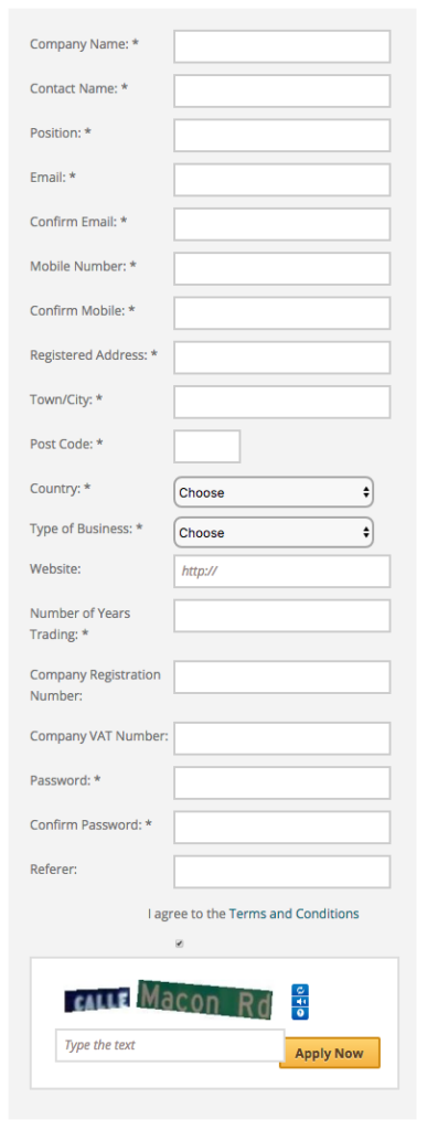
If you have a form that looks like this one you may be driving potential customers away before they even get going.

There are numerous studies (including this one) indicating that multi-step forms convert better than single page ones so if your form is one page (or is a series of long forms), test chunking the questions into multiple stages to reduce the user’s cognitive overload.
Hypothesis 6: Your form is too loooong
While having a large number of fields doesn’t necessarily correlate to a low completion rate, each question you ask a user is a point of friction that could potentially drive them to abandon. This means that you need to be very careful about evaluating which questions to include.
The obvious test for this hypothesis is to experiment by removing some form fields and seeing if completion is affected. In order to select which ones to remove you might want to use long-time forms expert Caroline Jarrett’s Prune, Tune, Postpone, Explain framework:
Prune – do you really need to ask this question at all? Be ruthless.
Tune – can you ask this question in a better way?
Postpone – can you ask for this information later? (Preferences that the marketing team want is a good example of this)
Explain – is it possible to improve the micro copy to manage user expectations?
If these hypotheses have whetted your appetite for data-driven analysis of form performance then you can find more techniques and tricks on the subject in Zuko’s latest white paper on using data to optimize form conversion. Zuko also has a direct integration with SiteSpect so you can view form user behaviour for your test variants to understand whether your experiments have delivered a positive impact.
Share
Suggested Posts
Subscribe to our blog:


